Public brand standards / 2026
BRIK64 Brandbook
A disciplined identity system for Digital Circuitality, formal software surfaces, and evidence-aware product communication.
Atomic
Compositional
Traceable
00 / Press Kit and Public Assets
Official SVG assets for press, partners, and public references.
This is the public asset shelf for BRIK64. The downloadable files sit beside the usage context so press, partners, and external teams can choose a mark with the right background, format, and implication.
Logo master note
The official SVG masters embed logo teal #19A7C2. The broader product UI token remains #1FAAC0.
Public context
Editorial, partner, analyst, community, and approved public materials can reference BRIK64 with the assets on this page.
The SVG files are the clean source for public reproduction; screenshots and traced approximations introduce shape, color, and spacing drift.
Co-branding works best when BRIK64 remains a distinct mark with its own protected space and hierarchy.
Partnership, customer, compliance, and release-status language is strongest when it cites the current announcement, release note, or public reference page.
Short boilerplate
BRIK64 is the formal layer for AI-era software, giving teams canonical blueprints, local `.brik` workspace context, reviewable structure, and governed workflows for software artifacts before they are trusted, reused, or exported.
Use this description for public references. Availability, certification, customer, compliance, and market-positioning details should come from current release notes or approved announcements.
01 / Brand Essence
The identity starts with discipline, not decoration.
BRIK64 reads as a serious product surface built on a deeper formal system. The brand is sharp, controlled, high-contrast, and grounded in reviewable product language.
Brand thesis
BRIK64 is the formal layer for AI-era software: a product surface for canonical blueprints, local `.brik` workspace state, reviewable structure, and governed publication.
Mission
Give teams a disciplined way to review, compose, compile, and govern software artifacts before they are trusted, reused, or exported.
Vision
Make software feel less like unbounded text and more like a system of inspectable, portable blueprints with visible review context.
.brik workspace
The `.brik` workspace is the local project state layer for BRIK64 workflows: logic maps, PCD candidates, decisions, refs, and review metadata beside the codebase.
Tone
Precise, restrained, technical, direct. The voice can be confident while keeping release, certification, and availability statements tied to their current source.
02 / Logo Hierarchy
Three marks. Three distinct jobs.
The identity system separates compact recognition, full-name recognition, and square full-brand composition. Each mark has a different role, scale threshold, and background behavior.
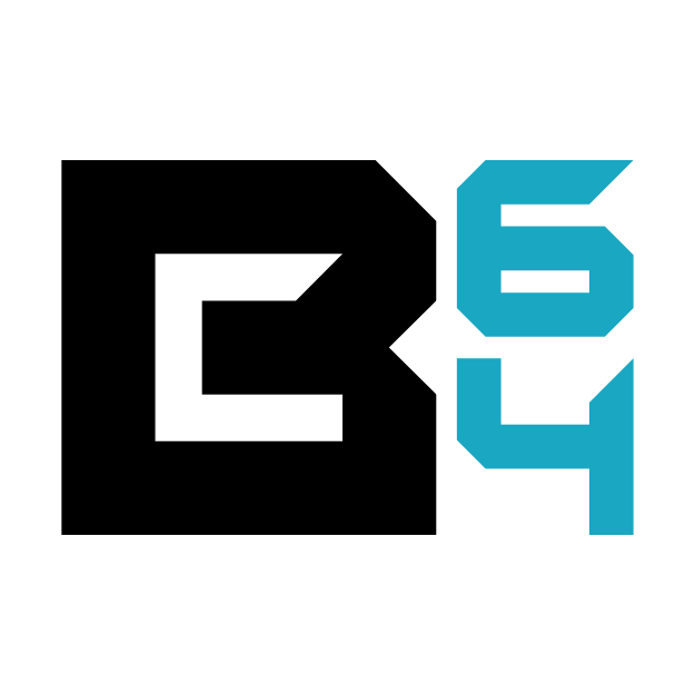
01 / Compact identity mark
B64 Isotype
The compact mark carries BRIK64 into small square environments where the full wordmark would become unreadable.
Primary contexts: Favicons, social profiles, service avatars, Google Workspace users, app tiles, pinned tabs, and compact product identifiers.
Minimum size: Digital: 32 px wide. Preferred: 48 px and above. Print: 10 mm wide minimum.
Clear space: Protection zone: at least 25% of the mark width on all sides.
Dark background variant
Light background variant
02 / Primary public wordmark
Horizontal BRIK64 Wordmark
The horizontal wordmark is the main signature for moments where the full name needs immediate recognition.
Primary contexts: Website navigation, product pages, documentation covers, presentations, event screens, email headers, and most brand layouts.
Minimum size: Digital: 120 px wide. Preferred: 160 px and above. Print: 32 mm wide minimum.
Clear space: Protection zone: the visual height of the 64 numerals around the full lockup.
Dark background variant
Light background variant
03 / Square-format full brand lockup
Stacked BRIK / 64 Mark
The stacked mark preserves the full BRIK64 name inside square compositions without reducing the identity to the isotype.
Primary contexts: App icons, apparel, stickers, square posters, packaging labels, social cards, merchandise, and event badges.
Minimum size: Digital: 96 px wide. Preferred: 140 px and above. Print: 28 mm wide minimum.
Clear space: Protection zone: the height of the B letterform on all sides.
Dark background variant
Light background variant
03 / Contrast and Sizing
Legibility comes before cleverness.
Legibility comes from contrast, protected space, and scale. White-letter variants belong on dark fields; black-letter variants belong on light fields. The teal 64 remains the continuity point across both.
Light fields / black BRIK + teal 64
Dark fields / white BRIK + teal 64
32 px
48 px
96 px
Minimum-size examples
04 / Color Tokens
Eight colors, each with a job.
The palette is deliberately narrow and even. Teal is the brand signal. Green, orange, and amber are state colors with operational meaning, not decorative noise.
BRIK Black
HEX #000000RGB 0, 0, 0
Logo field, high-contrast dark canvas
BRIK White
HEX #FFFFFFRGB 255, 255, 255
Inverted mark, editorial surfaces
BRIK Teal
HEX #1FAAC0RGB 31, 170, 192
Product UI accent, active focus, public brand signal
Graphite
HEX #0A0D12RGB 10, 13, 18
Primary website background
Circuit Gray
HEX #98A3B3RGB 152, 163, 179
Secondary text, metadata, borders
Signal Green
HEX #45D483RGB 69, 212, 131
Operational success state
Extended Orange
HEX #FF8A1FRGB 255, 138, 31
Extended review state, advanced workflow, or secondary product emphasis
Warning Amber
HEX #FFB84DRGB 255, 184, 77
Draft, attention, or release-status information
05 / Typography
A readable technical system.
The typography system feels engineered without becoming sterile. Display text is sharp. Body text is calm. Mono text is reserved for system facts, tokens, and technical metadata.
Display
Inter Tight
Headlines, section openings, large editorial statements
Weight 400-600, tight line height, no negative letter spacing in CSS.
Body
Inter
Paragraphs, navigation, product surfaces, UI text
Weight 400-600, strong readability at 14-18 px.
Technical
JetBrains Mono
Tokens, file names, release states, code-adjacent labels
Best suited to metadata, system labels, and technical references.
Brand Accent
Jura
Optional brand-led display treatments
Reserved for recognizability moments where legibility remains strong.
06 / Applications
The mark changes with the surface.
This section turns logo choice into visible placement logic. Each preview shows a different reading distance, frame, crop behavior, or trust context.
01 / Digital identity
Small and screen-native placements
These surfaces are judged in a fraction of a second: browser tabs, launch icons, account slots, navigation rails, and social previews. The B64 isotype and horizontal wordmark carry recognition without asking the viewer to read a full composition.
Navigation surface
Website header
The horizontal wordmark reads quickly in the top rail while the rest of the interface carries navigation, product references, and entry points.
Small identity surface
Favicon and profiles
The B64 isotype keeps the B form and 64 numeral visible in browser tabs, social avatars, service users, and square account slots.
Shared preview surface
Square social card
The stacked mark creates a compact full-name lockup for Open Graph, square posts, community thumbnails, and launch graphics.
Product launch surface
App icon
The isotype becomes the product's launcher identity, supported by graphite, black, and teal rather than decorative illustration.
02 / Public collateral
Documents, interfaces, status, and physical objects
These surfaces have more reading distance and more context. The horizontal and stacked marks can carry the full brand while status colors, grids, and measured spacing keep the system precise.
Executive and technical collateral
Document cover
The black-letter horizontal wordmark anchors light covers, proposals, implementation notes, and investor-facing documents.
Software surface
Product UI
The brand appears as a quiet shell anchor; interaction meaning comes from grid, status colors, metadata, and evidence language.
report-backedextendedpending
Claim-sensitive surface
Evidence status
Visual status labels should describe a clear source state: draft, beta, preview, available, observed, or documented for the referenced surface.
Physical identity surface
Merchandise family
The stacked mark has enough mass for apparel, mugs, stickers, patches, and square objects where the brand needs physical presence.
07 / Brand in Use
Application examples across product and public surfaces.
These examples show how the logo system behaves when it leaves the guideline page: small app icons, social crops, shared previews, product chrome, documents, and physical formats.
Compact launch surface
App icon
The B64 isotype gives the product a sharp square signature at small sizes. The mark reads as a system icon first and a brand object second.
BRIK64
@brik64
Avatar and service identity
Social profile
Profile surfaces reward immediate recognition over full-name spelling. B64 keeps the B form and 64 numeral intact inside circular crops.
The formal layer for AI-era software.
Canonical blueprints, reviewable structure, governed workflow.
Shared link preview
Open Graph card
The stacked mark gives square and landscape thumbnails the full BRIK64 name without compressing the horizontal wordmark.
Blueprintready
Evidenceextended
Exportready
Navigation and product chrome
Product interface
The horizontal wordmark anchors the product shell while teal, graphite, grid lines, and status tokens carry the interaction system.
Brand Standards
Evidence-aware product identity
Public reference deck / 2026
Executive and technical documents
Deck cover
The wordmark creates a quiet institutional header. The page can then carry dense technical content without competing with the logo.
Apparel, sticker, and patch formats
Merchandise
The stacked mark has enough mass for physical reproduction and enough name recognition for square textile or sticker placements.
Physical merchandise system
The mark needs mass, contrast, and distance.
Physical objects compress detail through fabric texture, curvature, lighting, embroidery, and viewing distance. These examples show which mark carries best across common formats.
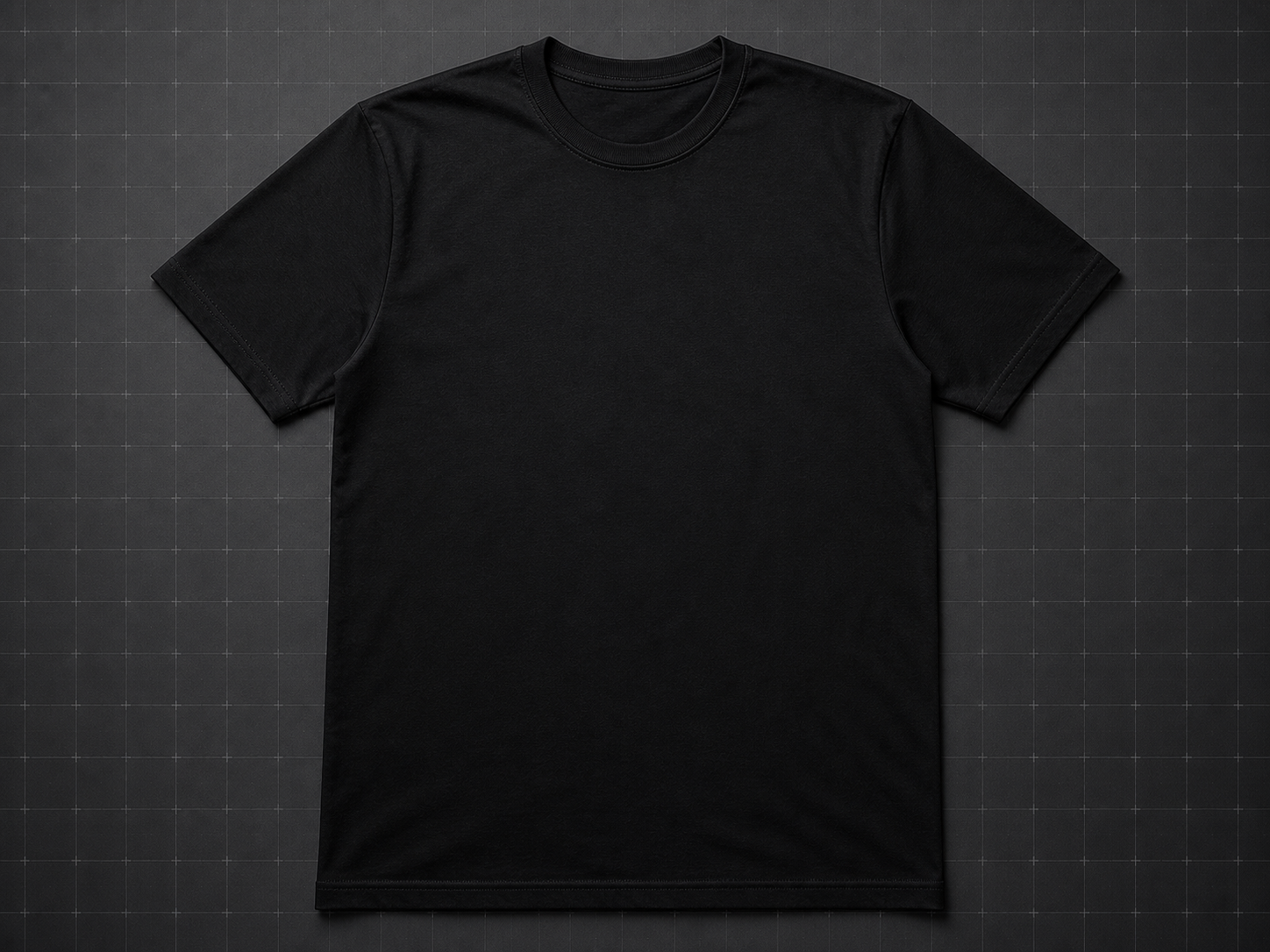
Chest print
Black tee mockup
Stacked mark centered on a flat textile surface, sized for distance and fabric texture.
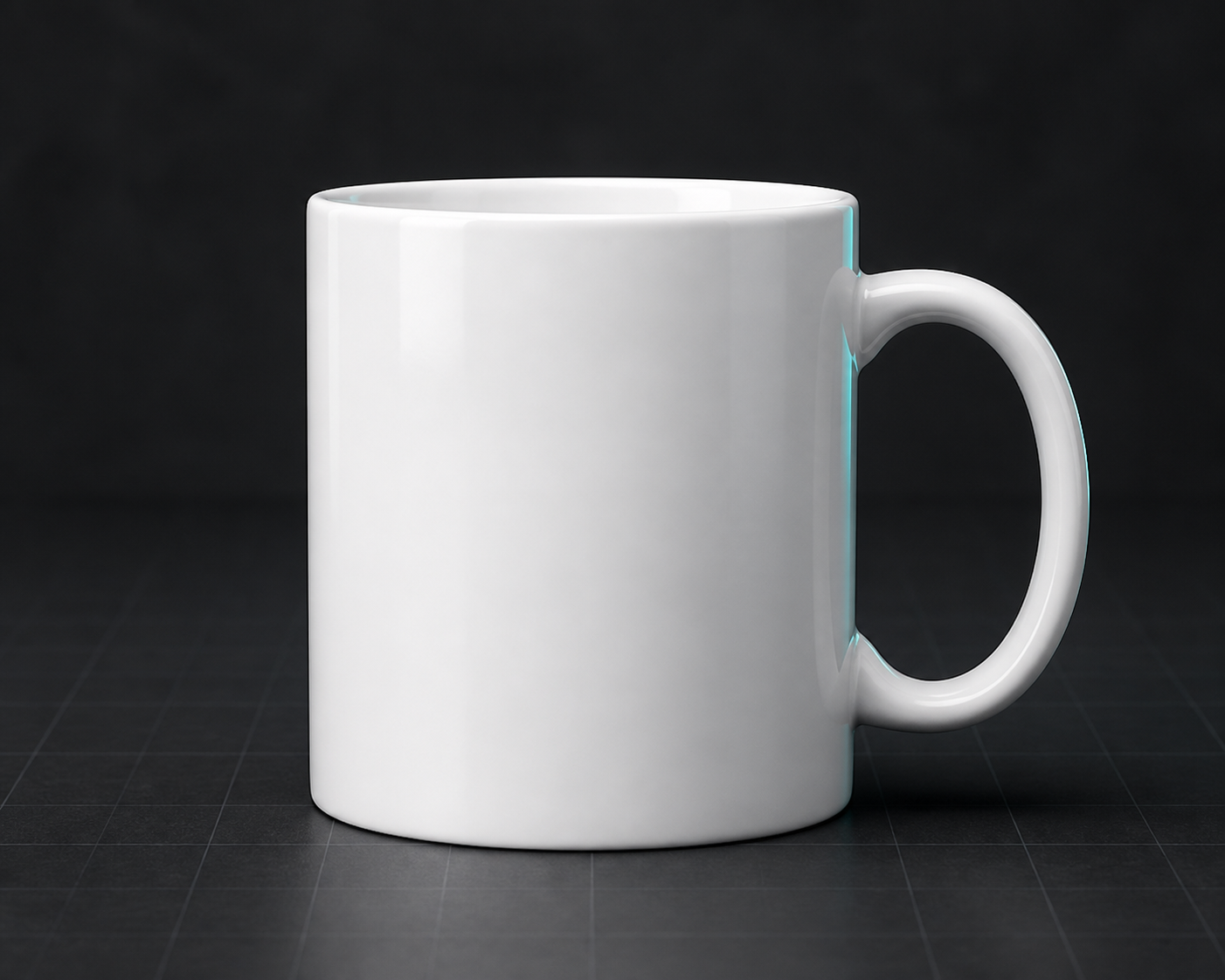
Daily object
Ceramic mug mockup
Horizontal wordmark applied to a simple front view where curvature remains controlled.
Mixed-format giveaway
Laptop sticker mockup
The three logo families can coexist when each sticker has its own clear format.
Small physical badge
Embroidered patch mockup
B64 is the best compact mark when thread, scale, and square framing matter.
Chest print
Black tee
Stacked mark centered high on dark textile, with enough mass to survive fabric texture and distance.
Daily object
Ceramic mug
Horizontal wordmark wraps better on a curved object when the reading angle is wide and close.
Mixed-format giveaway
Sticker sheet
A sheet can carry B64, horizontal, and stacked marks together as a compact identity system.
Small physical badge
Embroidered patch
The B64 isotype is the cleanest candidate for thread, patch, and compact square production.
Event utility
Tote or badge card
The stacked mark gives event materials a strong square read without losing the brand name.
08 / Voice and Public References
Confident language, clear source.
BRIK64 language is strongest when it explains the product clearly and sends changing availability, release, and certification details back to their current public source.
Use product language such as “formal layer,” “canonical blueprint,” “reviewable,” “portable,” “traceable,” and “governed workflow.”
Use “.brik workspace” for the local project state layer that carries logic maps, PCD candidates, decisions, refs, and review metadata beside the codebase.
Use release-state language such as “available,” “beta,” “closed beta,” “preview,” “documented,” or “in development” when the linked source supports it.
Frame `.brik` metadata as local workspace context and pair release-status statements with the current artifact, release, or reference page.
Pair certification, formal-proof, self-hosting, and broad correctness language with a live source that defines scope, maturity, and evidence.
Anchor customer, compliance, revenue, adoption, and market-leadership statements in approved business or announcement materials.
09 / Precision Checks
Where the identity loses precision.
The following examples explain the failure mode behind common brand mistakes. The goal is recognition, contrast, clear source language, and consistent public identity.
Distorted geometry makes the mark feel improvised rather than engineered.
The teal 64 is the recognition anchor; alternate accent colors weaken continuity.
Contrast mismatch hides part of the logo and makes the brand look broken.
The 64-only support graphic lacks the B form required for the compact isotype.
Cropped wordmarks create unofficial lockups that are harder to recognize and govern.
Customer, compliance, certification, and market-positioning statements need their own current public source.
Deliver the brand as a system.
A strong BRIK64 asset carries the right mark, contrast, clear space, and source-aware language at the same time. The press kit packages the public summary and downloadable SVGs for external reuse.